
Emily Bisset is currently an intern at P&G in Gillette’s visualization team. After graduating, she started using Substance 3D Designer and now loves creating procedural materials in her free time.
Introduction
This project was created 100% in Designer then rendered in Marmoset Toolbag 3. Designer provides a library of nodes such as shape generators, filters, blending nodes, grunges—the list goes on. Most graphs will probably start from a simple shape such as a circle or rectangle.
In a lot of projects when starting off with this software the PBR Roughness/Metallic workflow is used. The maps generated will be Normal, Height, Roughness, Metallic, Ambient Occlusion, and Base Color. There are lots of great beginner tutorials on Designer that will explain all this far better than I can, so I highly recommend checking some out to understand the basics of PBR texturing as this will help a lot when understanding how the software is used.
I absolutely loved creating all the little patterns – especially the deer! I really enjoy experimenting with Designer and seeing what intricate patterns I can make. In this article, I will be covering my thoughts behind the pattern designs and how I went about creating them. I would love to say I knew exactly what I was doing from the beginning but the truth is every project I take on in Designer I learn something new. Whether it’s a new technique or a better, more efficient way of doing something. That’s what I love about the software—I like the art I create with it but I know there will always be better ways of doing things and new nodes I’ve yet to discover. So I am always excited to jump straight back in and start a new project because I know that I’m only just scratching the surface of its capabilities!
I’m a big fan of Designer, the procedural nature of the program allows users to go back and tweak things without losing any progress. Because of this, it is far easier to experiment and learn inside the program without fear of ruining your project. This really helps speed up the learning process for me. For example, you could add in a Slope Blur node midway through your pattern to see how it would affect your outputs. Then, if it didn’t give you the desired effect you can simply reconnect your nodes so that it’s excluded and your back to where you were to begin with.
I would urge anyone contemplating trying it out to definitely give it a go. It may seem daunting at first but it’s really easy to get to know the basics of. I find that because the interface is so easy to pick up, users can spend more time working on their material authoring skills rather than struggling with the ‘how do I physically do this?’ bit.
Mood Board and Inspiration
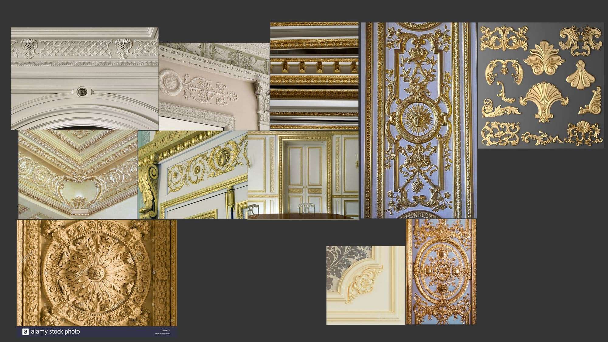
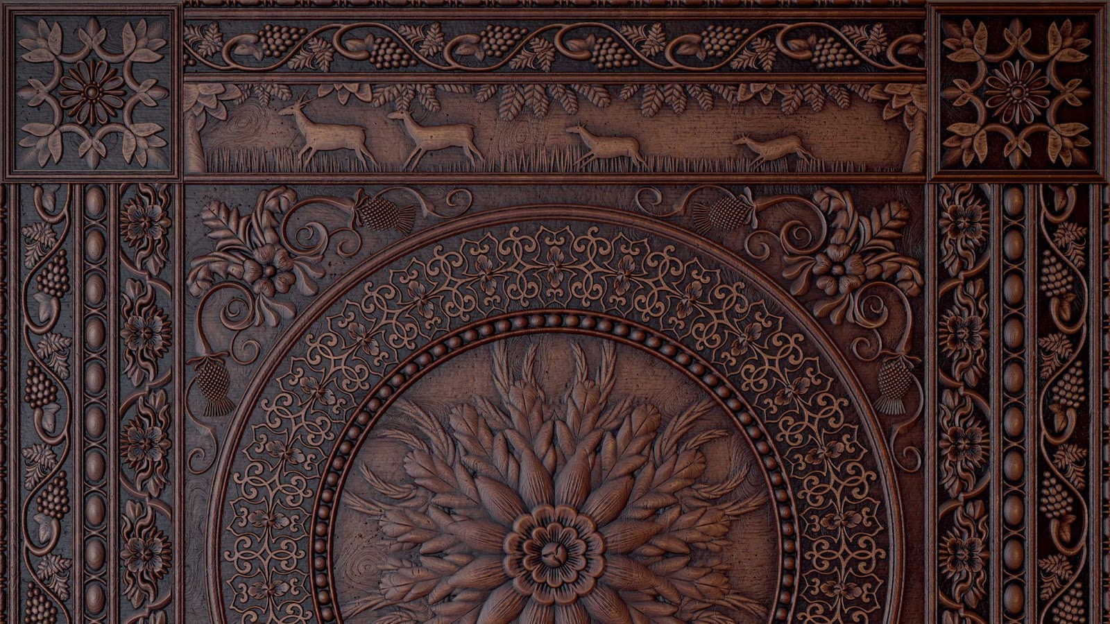
I knew for this project I wanted to do a hard surface that allowed me to still put in a lot of ornate shapes. I thought about a stone trim sheet at first but then I wanted to make something that I could include small details with and stone doesn’t usually include fine details as much as other materials (though it’s definitely still on the list of projects I want to do!). I then thought about those gorgeous Victorian-style panelings and moldings you find along walls and ceilings in fancy houses (or palaces should I say!). I even got to creating a small mood board for them as I was mesmerized by all the little intricacies.
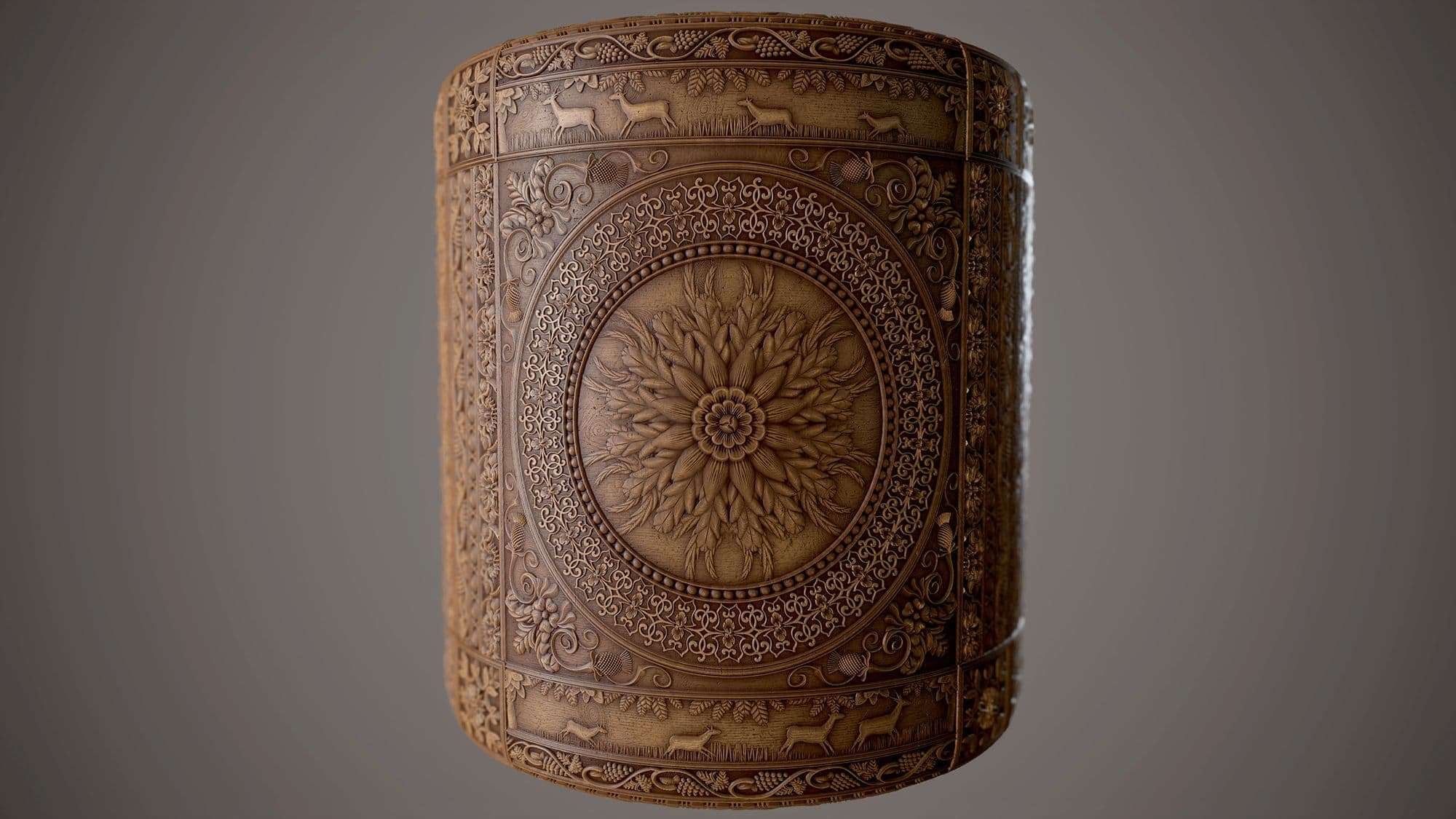
In the end, I decided on a wooden box/paneling material since I hadn’t really attempted any wood materials yet and since I am trying to build my portfolio so that I can start applying for jobs after my internship finishes; I thought it would be good to include a wood texture. This was my mood board for the wood:
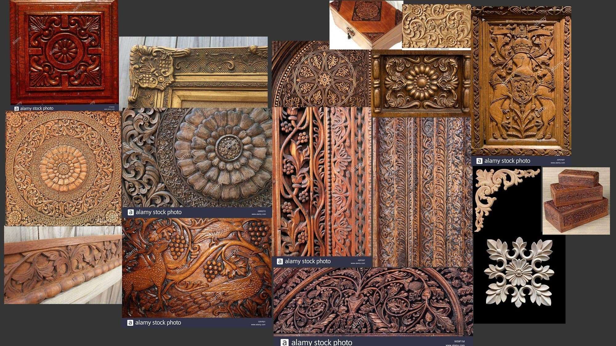
As you can see it’s not far off of the regal wall trim patterns I had in the previous mood board but this also helped as reference for the actual wood texture. You can see there are a couple of patterns I used directly following these images. Then other patterns I used these images as a base and then built on them from there.
When it comes to inspiration from other artists, I find Pauline Boiteux’s work absolutely breathtaking. In my opinion, she is the Queen of Designer and I aspire to have her level of skill and attention to detail one day. Not only is her fabric work exquisite, but she has done similar paneling/carving materials too which are also incredible.
Planning the Design
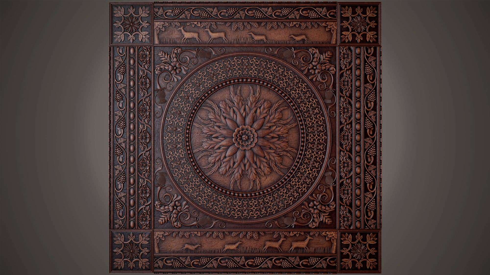
Like with many projects, it’s always easier to break it down into more manageable chunks. So I decided to split up my 1×1 square into different sections so that I could work on each individually. This helps to not be overwhelmed by trying to think up all the patterns at once.
I knew from quite early on that I wanted to be able to make a trim sheet from this material. I was (and still am) tempted to use it in a future asset/prop creation project. Therefore, I wanted to have defined rows and columns for patterns to fit into. Meaning that when I eventually create the trim sheet it would be easy to put the patterns all onto one sheet.
I also decided at the beginning that I wanted my material to have a large center pattern. This would most likely be a flower of some kind like some of the images on my mood board. I later added the corner box patterns as it became apparent that I could not have my rows and columns connecting with each other. Something about all the patterns converging didn’t look right. I thought there should be something of interest in each corner. A bit like the picture frame image on my mood board—I also just wanted a chance to fit more patterns in!
Creating the Patterns
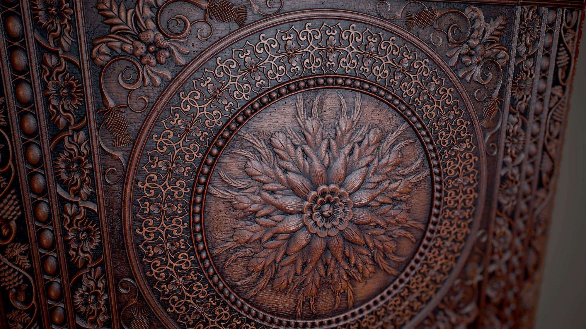
The center pattern is basically a lot of interesting floral shapes blended together. I definitely got a good amount of use out of the Splatter Circular node during this section. Most of the ‘petals’ all started from a circle that had then been scaled in the Y direction. I then used the Trapezoid Transform node to scale the bottom to give it the leaf/petal shape.
Height Blending
When it comes to blending the height data there are many ways to do this. I’m still not sure which is the ‘right’ way of doing it but I find I will use different methods depending on the situation. For example, if I know I’m going to need the masks from each of the two inputs being blended then I will most likely use the Height Blend node. But sometimes if that’s not the case, I will usually use the regular Blend node probably with the Max Lighten, Screen (with a mask), or Add blending mode. But again this depends on the project and what effect I want it to have.
I have also seen people use the Blend node in a way that each pattern has their own blend node and is plugged into the opacity input of the node. Then, a grayscale Uniform Coloor node is plugged in so that you can directly change the height values for each individual pattern being used. I tried this out for a couple of patterns and I can see the benefit for making materials like this that are very pattern heavy, especially when everything has a place (there’s no mixing of patterns). I don’t think I would use that method for materials that require more height variation (for example a forest floor with leaves and sticks etc.). Obviously, this all comes down to what material is being created and sometimes just personal preference. I’m sure some artists may have different ways of doing this but these are the methods I use at the moment. But as I’ve said before, I’m always finding new, more efficient ways of doing things in this program!
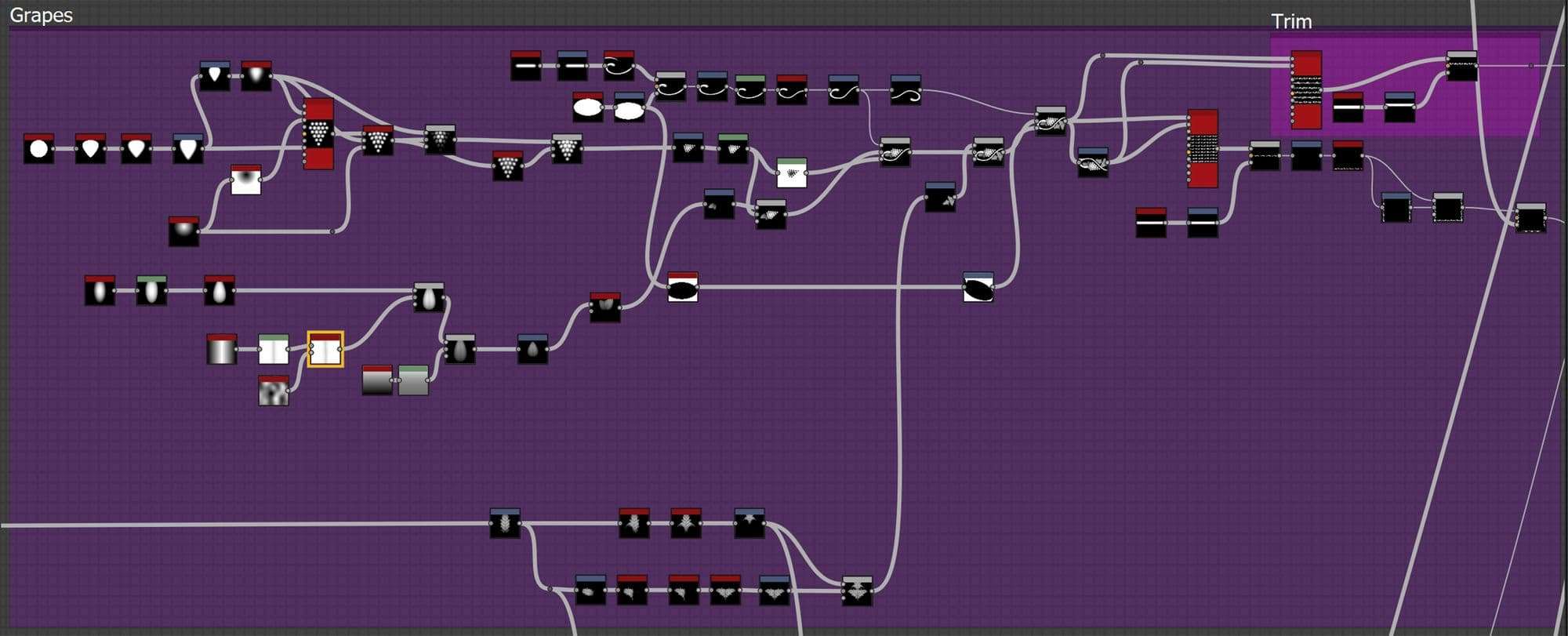
Grape Vine
The grape vine was one of the first patterns that I started with. I had seen it on one of the reference pictures and I thought it would be an interesting challenge to try and recreate. The most difficult part was making the patterns join up properly. I wanted to give the effect of the vines all being connected while only making one iteration of the grapes and leaves. I ended up splitting them where the leaves meet the vine then having a flipped version as well as the original to input into my Tile Sampler. It took a lot of trial and error to make sure the seam between each pattern wasn’t noticeable.
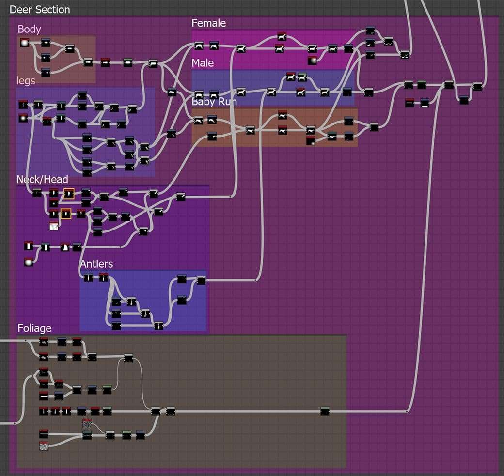
Deer
Making the deer was a really enjoyable task for me. It was something I decided on adding in a bit later on. Through researching lots of carved wood panels, I saw a lot of nature-themed carvings (birds and deer mostly) and so I wanted to add something like that in. I felt it would give the piece an extra bit of interest. I love for people to be able to discover more details the more they look at ornate artwork like this.

The deer shape was relatively simple to achieve. I had attempted a similar pattern for one of my Nodevember 2020 materials where I made a prehistoric cave painting so I already had a base of where to start. It was basically a load of circle shapes blended together to make the initial deer shape.
I then used a Directional Warp node to change the deer’s shape slightly so they weren’t all completely identical. I then added in the father deer’s antlers and then placed them. I used the ‘Messy Fibres 3’ node masked out by a warped horizontal line shape to make the grass. I then added in the overhead leaves, it looked a little plain without them particularly as the rest of the material was so busy. I also wanted it to look like they were in a forest rather than just a field so I thought the leaves were a good addition.
The leaf shapes were recycled from the previous patterns I had made. Similar shaped leaves can be found in the center, on the grapevines, and around the center pattern’s corners. I used a Splatter Circular with a high ‘spread’ value to bunch the leaves together. I could have made more variations of leaves. However, because it’s quite a large material with a lot going on I didn’t feel it was as necessary—plus the graph was already getting to be rather large!
Wood Texture
I wanted to go for an aged varnished wood for this material (for the darker color). So it had the nice sheen from having been varnished but also still had a few imperfections. As well as collecting reference, I also used the memory of my grandfather’s old desks/tables that were made out of very old, ornately carved wood.
These items had a very dark color to them. They seemed to have been varnished when they were made (over a hundred years ago I would have guessed) but were not as shiny as newly varnished wood. I added in the lighter base color map during the rendering phase as I thought it would be nice to see the patterns on a lighter wood material. I didn’t change any of the other maps when I changed the base color other than adjusting the ambient occlusion slightly. The lighter colour obviously makes it look less aged. But I still liked how the renders turned out, it meant less detail was lost in the darker patches so it was a great alternative look for the material.
Height/Normal
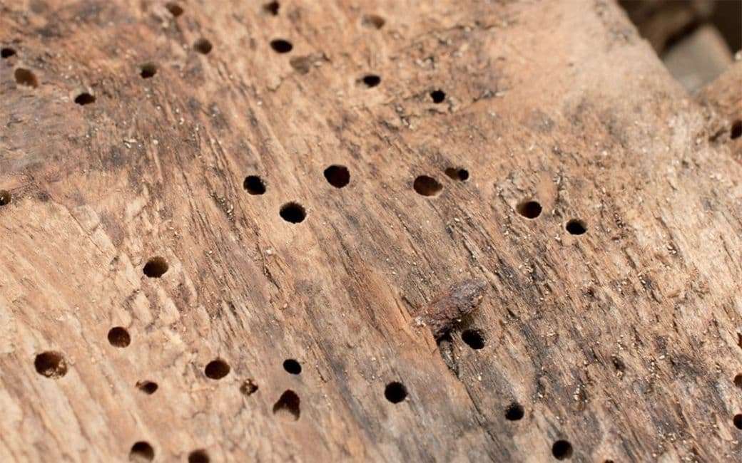
Without considering the carved patterns, the texture has a fair amount of height data to show its age. It also makes it more interesting visually as opposed to a completely smooth piece of wood. I also added in some woodworm holes and scratches which are commonly found on very old wood sculptures. I also added some knots into the wood pattern. Although, from what I saw in the reference images wasn’t as common as I thought (there were only a couple of images where you could see knots in the wood). However, considering the scale this panel would be (to fit that much detail in it would have to be relatively big) I decided to add a few anyway. It may not be completely accurate, but I felt it made the texture read a lot better. It also added that extra bit of visual interest which I feel is important when making materials like this.
The wood lines were interesting to add. I wanted to see them on the carving’s raised areas as well but I couldn’t just add them over the top as it would make it seem fake. This is because where the wood is being carved into it would make the shape of the wood lines warp. This effect can be seen clearly in the image below.

To try and recreate this I used a directional warp on the lines texture driven by the full patterns alpha. I used two directional warp nodes one warping upwards and one down. This meant I got a nice varied result and showed the nice ‘circling’ of the lines on the center flower’s petals as this is one of the areas where the lines would be most prominent.

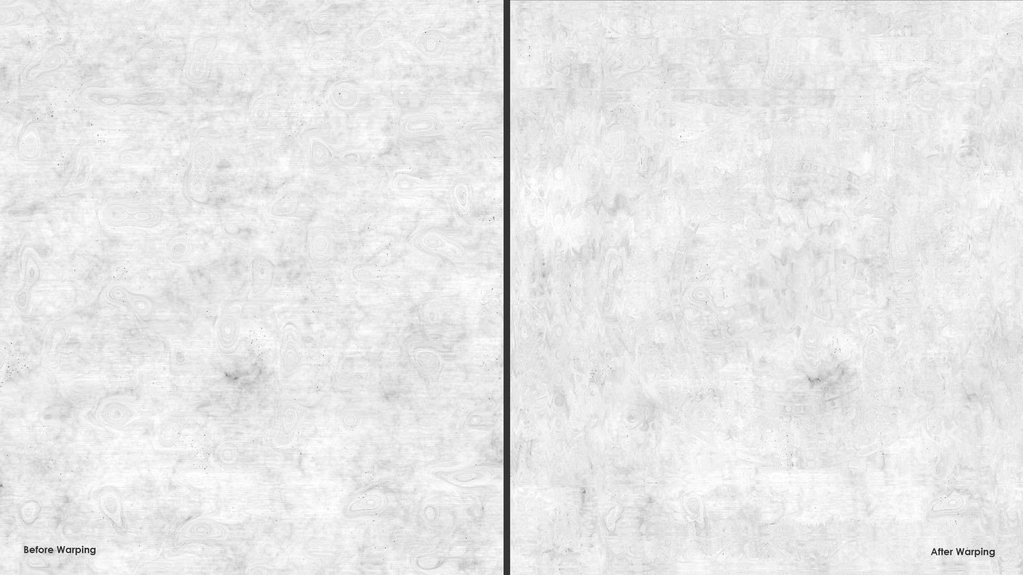
The image below is what is used in the graph however, it’s a little hard to see so the next image is where I have run the two through a HBAO filter to see the lines more clearly.
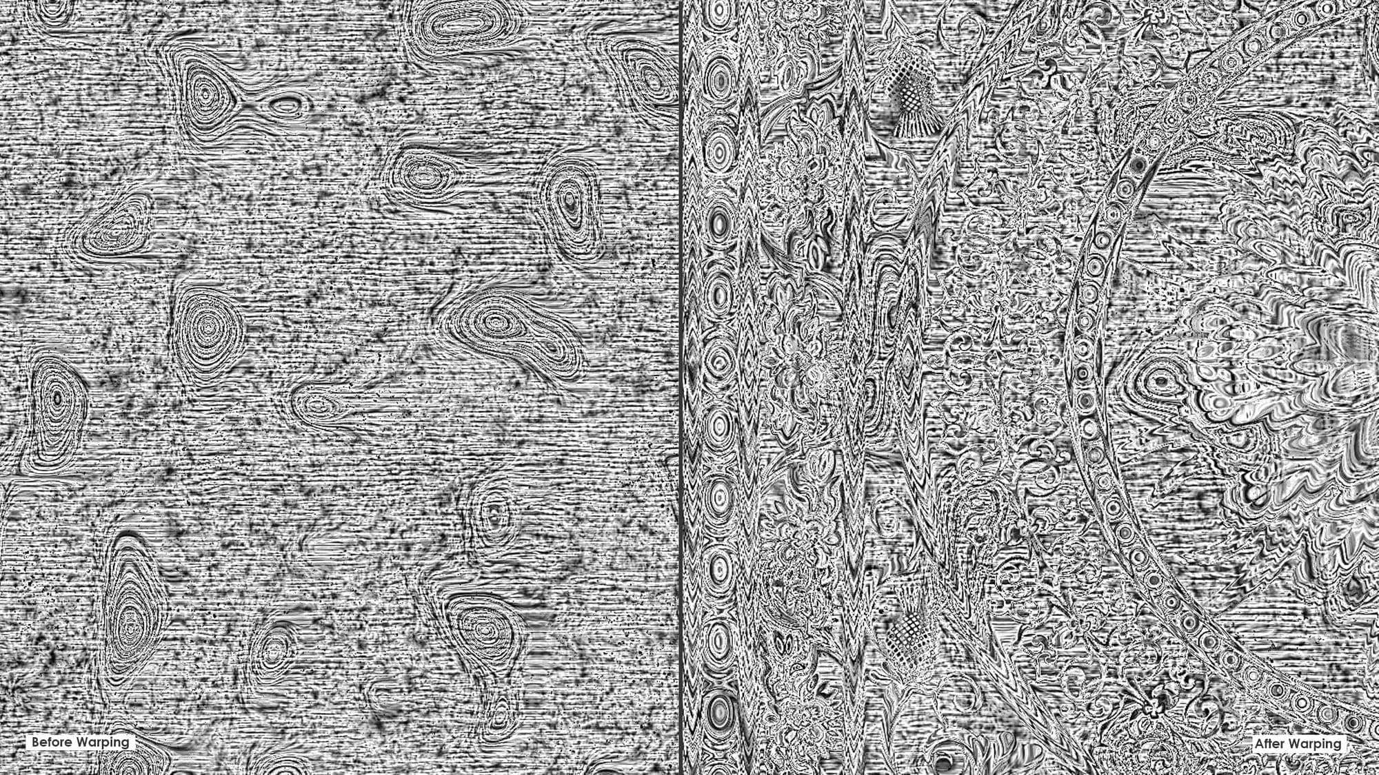
This effect is only very subtle so can only be seen really close up on the larger carved patterns in the renders. But I wanted to include it anyway partly because it added a nice level of detail but also it was a fun challenge to recreate this as I hadn’t attempted it before.
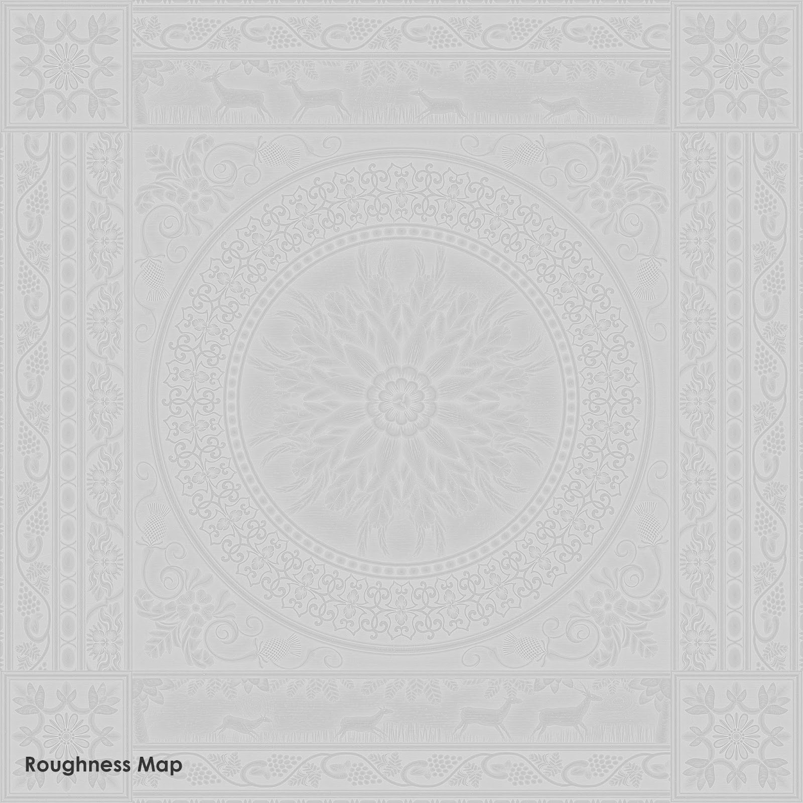
Roughness
I played a lot with the roughness, it was probably the map I iterated over the most. I think I still have a fair amount to learn when it comes to getting light to bounce off of the material in the exact right way. It was also difficult to choose whether it would be best to have shiny, newly varnished wood or to go for a more rough carved wood.
In the end, I leaned more to the rougher side of the spectrum but still having a small specular level value so that there would still be a nice amount of light bouncing off of it. This to me shows that it had been varnished at first but has now aged a fair amount. I made the edges of shapes a little rougher and the shapes that were sticking out less so. This would give the effect that it had been polished during routine cleaning but not thoroughly as the ‘hard to reach’ sections were still a bit dusty. I imagined someone wiping it over with a cloth and a bit of polish and thought about what sections would have more contact with the cloth and therefore be cleaner compared to others.
Metallic/Specular
For this material, there were no metallic parts so I didn’t generate a map for it. I instead outputted a specular level map and then made small adjustments to its intensity in Marmoset until the light reacted to the material the way I wanted it to. I don’t have too much knowledge in this area but enough to be able to experiment with this until I get the result I want, which helps me learn as I go.
Ambient Occlusion
The ambient occlusion map was super helpful for this material as it really helped bring out the patterns and show more depth in the material. I feel like I always go a bit mad with the AO so I’m trying to work on that in my current projects! For the lighter wood renders I toned it down a bit as it was a bit harsh but I really liked the result it gave for the darker wood.
Base Color
The base color map isn’t overly complex for this, I had one overall color and then a highlight and a shadow color. The shadow color was mostly influenced by the AO map as that’s where I wanted the wood to be darker to show it had gotten slightly dirtier than other parts. Referring back to my cloth and polish idea, I made the larger and higher patterns lighter to show those areas had probably been cleaned more. I followed the same method of coloring for the lighter wood but obviously with lighter colors!
Making the Trim Sheet
The trim sheet was relatively quick to make after the original material was created. I kept it all on one graph which may or may not be the best way of doing it but for me, I like to see exactly where each input is coming from and although it became a little ‘noodlicious’ (lots of graph input/output connectors getting confusingly mixed together – like noodles.). I essentially just placed the pre-made patterns onto a new set of maps, adjusting any details that needed to be changed. For example, the scale for the trim sheet was smaller than the original so I put in fewer knots in the wood.
I used some of the center and corner patterns as decals to fill up the sheet but later created some more trims to replace them.

Rendering
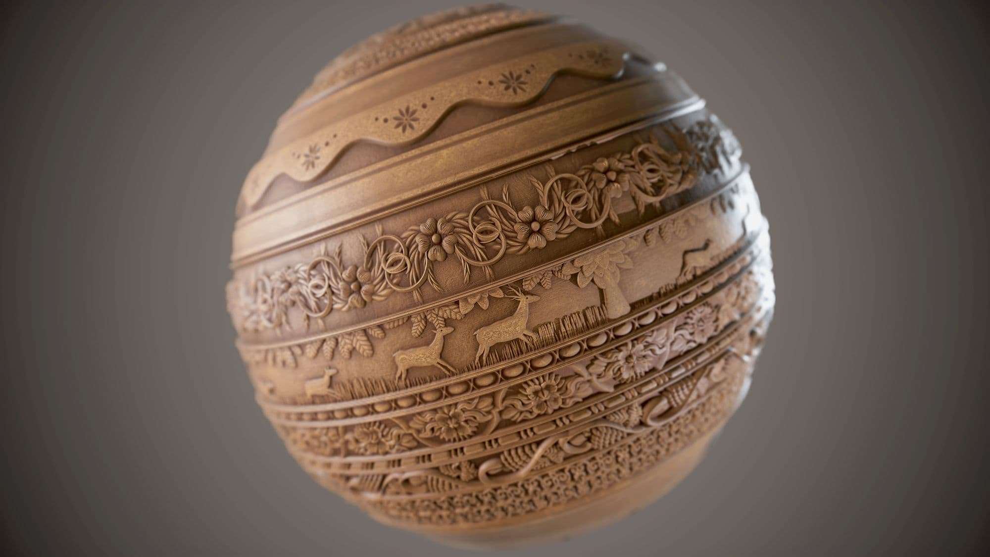
The rendering itself took me a full day (and then going back to get extra shots later on). I like to take my time with rendering as it can really make or break a material. I wanted to make sure I got a lot of close-up shots as well as full shots for this material so the details were clear to see.
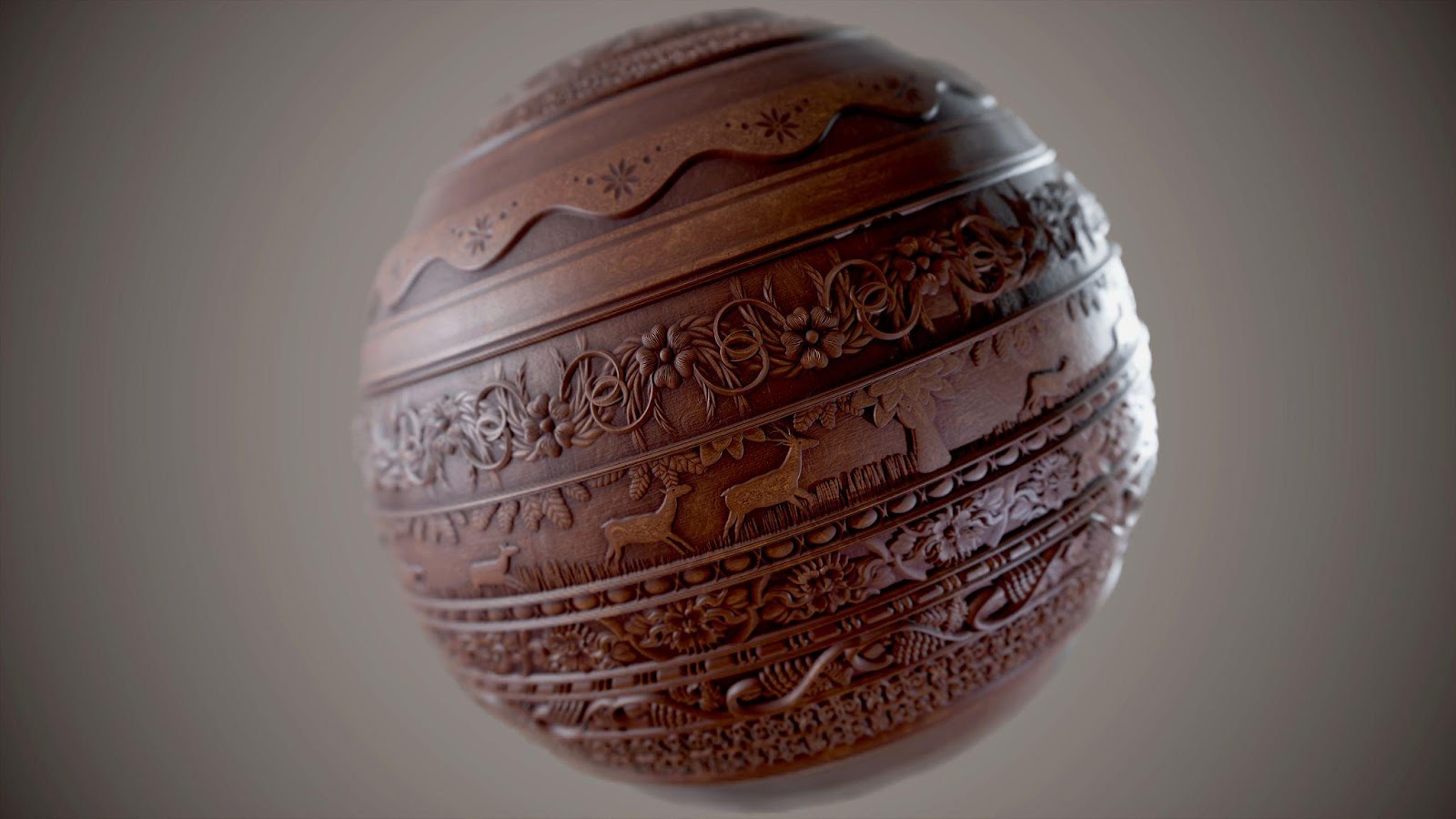
When rendering the second iteration of my trim sheet I wrapped it around a sphere. I couldn’t really do this with the original pattern as it was too big to wrap around without missing out on the border panel’s details. A great tip I learned while chatting to Nikolay Marinov about some of his latest work is that by tilting the sphere slightly, it allows the light to hit from different angles which can really help showcase the material’s roughness and height values. Niki is another incredible material artist with spectacularly detailed work that I really admire.
After taking all my renders in Marmoset Toolbag 3 I then put them into photoshop for the finishing touches. This is usually just adjusting the exposure, curves and levels. It is possible to do most of this inside Marmoset in the camera settings. However, I prefer to do it in Photoshop as you have more control over it and can experiment to find what parameters work best.
Conclusion
That more or less sums it all up, obviously this process sounds a lot more organised when I write it all down! As always, this project had a lot of trial and error in some parts but this resulted in a lot of learning opportunities which are really valuable for young artists like myself. I’m pleased with how this turned out but as I said before there is still so much more for me to learn in Designer.
I have been using the software in my evenings and free time for about 9 months now so I can’t wait to see what more I can create over the next 9 months!
If anyone has any questions about this material or would like to find out more please feel free to reach out to me on ArtStation, Instagram, or Twitter—I love a good chat about materials!


